As someone who still enjoys a hearty bowl of children’s cereal from time to time, I’m finding that the cereal aisle has become frightening and confusing. It is striking just how much our favorite logos and mascots have been changed and rebranded. Without. Our. Permission.
Like every 90’s kid, I firmly believe everything must have been better back in the day. So to whoever is changing all those good memories: stop it.
1. Lucky Charms
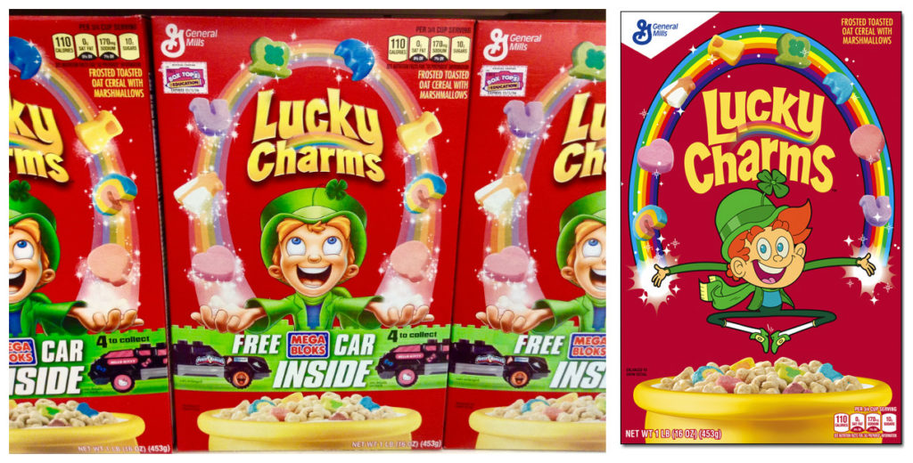
Photo courtesy of Mike Mozart on Flickr.com
I don’t know who decided to take Lucky the Leprechaun and iron him out, but it was quite the disservice. I’m not sure what General Mills decided what was more inviting about a flat character, and I can’t help but wonder if they know how they’re flattening our dreams, too.
As long as the taste isn’t flattened, there’s less reason to be grumpy. Especially since the cereal has now gone gluten-free. Let’s keep our fingers crossed that Lucky Charms stay magically delicious (and magically 2D, I guess).
2. Trix
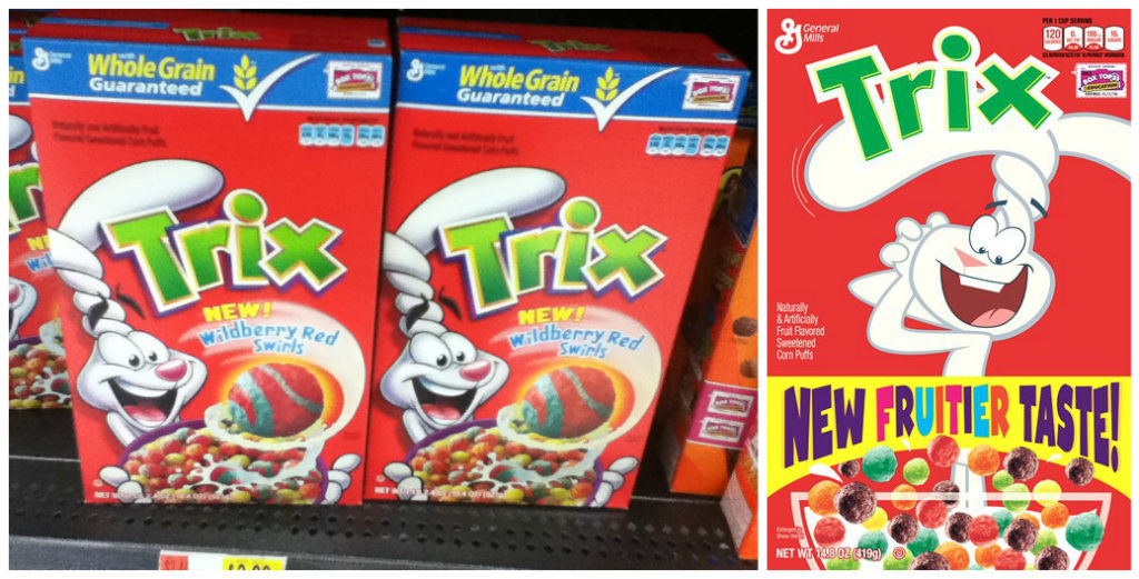
Photo courtesy of Mike Mozart on Flickr.com
There’s been a lot of debate on whether or not Trix are supposed to be colorful little balls or shaped like fruit. It turns out that the fruit shapes only debuted from 1991-2006, before Trix reverted back to the original puff ball shape. I’m sure I’m not the only one to feel like that was a mistake.
General Mills also gave the rabbit a bit of a makeover, giving him what they call “a more retro, cartoon character look” I’m onto you, General Mills. Stop ironing your characters.
3. Cinnamon Toast Crunch
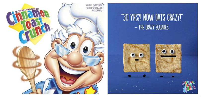
Photo courtesy of blog.generalmills.com
You really don’t know what you’re missing until it’s gone. Chef Wendell, the snowy-haired, friendly looking old man on the Cinnamon Toast Crunch box has been missing since 2009. He’s been replaced by what General Mill’s calls “the Crazy Squares,” which is pretty appropriate considering they openly practice cannibalism.
I think what I’m trying to get at here is that we no longer have a visual representation of who is making these cinnamon toast squares. It makes sense now that they’re resorting to cannibalism when they have nobody (like nice ol’ Chef Wendell) to regulate them.
4. Honey Nut Cheerios
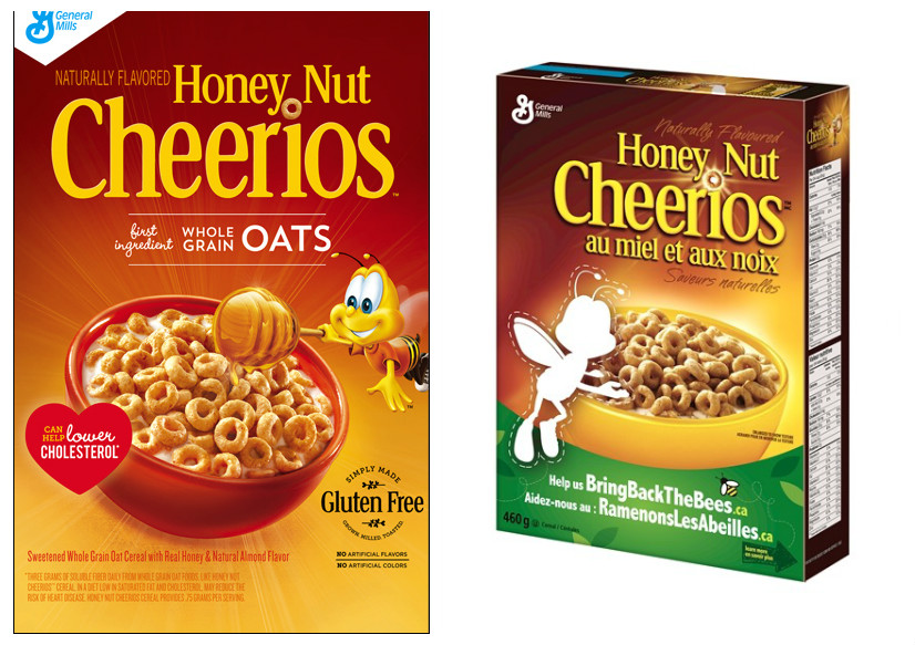
Photos courtesy of blog.generalmills.com
This is by far the least offensive, yet most striking change made to a cereal box design. Though the campaign is currently only running in Canada, Honey Nut Cheerios have removed BuzzBee from their boxes, leaving a blank cutout in his wake. The idea of the campaign is to raise awareness of the rapidly declining bee population.
It’s been done with good intentions, and we definitely need to be watching out for our bees. The campaign only serves to make BuzzBee’s disappearance even more heartbreaking. #BringBackBuzzBee!
5. Oreo O’s
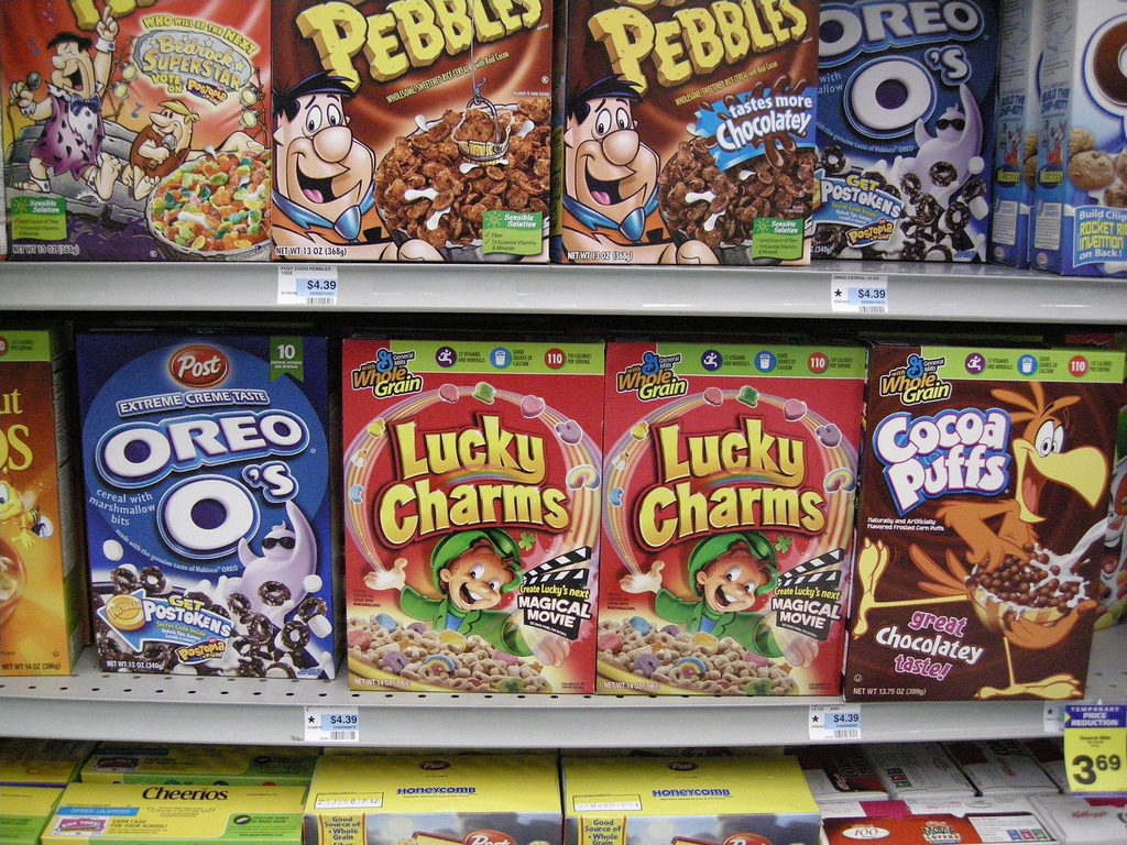
Photo courtesy of Doc_Brown on Flickr.com
Technically, this was just straight up discontinued in 2007. The only manufacturers past then were in South Korea, which means boxes were still for sale on Ebay. Eventually, though, even they discontinued production altogether in 2014. So, while strictly speaking not a rebrand, it still makes me mad. Oreo O’s are worth the fight.
If we’ve learned anything from this brief examination of our old cereals, it’s that General Mills is not to be trusted. Stick to Kellogg’s, who have managed to keep their cereals mostly true to how we remember them. (Though, tbh, I’m probably still going to eat everything on this list.)


