All too often we catch ourselves staring into our television and computer screens at fast food advertisements thinking, “Wow, that double cheeseburger actually looks really appetizing.” Seconds later, however, we find ourselves wistfully realizing that no drive-thru burger is ever going to look that good.
But just how different is an advertised meal from the real thing? We dropped in at a handful of popular fast food joints and picked up classic menu items to put the issue to rest.
1. McDonald’s Big Mac

Photo left courtesy of McDonald’s. Photo right by Jessica Liu
Although the buns look fluffy here, they also take up 75% of this burger. The lettuce and pickles that are clinging to the side for dear life hide almost everything else. If burgers were people, the advertisement of the Big Mac would be “Oops!… I Did It Again” Britney Spears, whereas the real-life Big Mac is more Britney circa 2007 – sloppy and essentially all over the place.
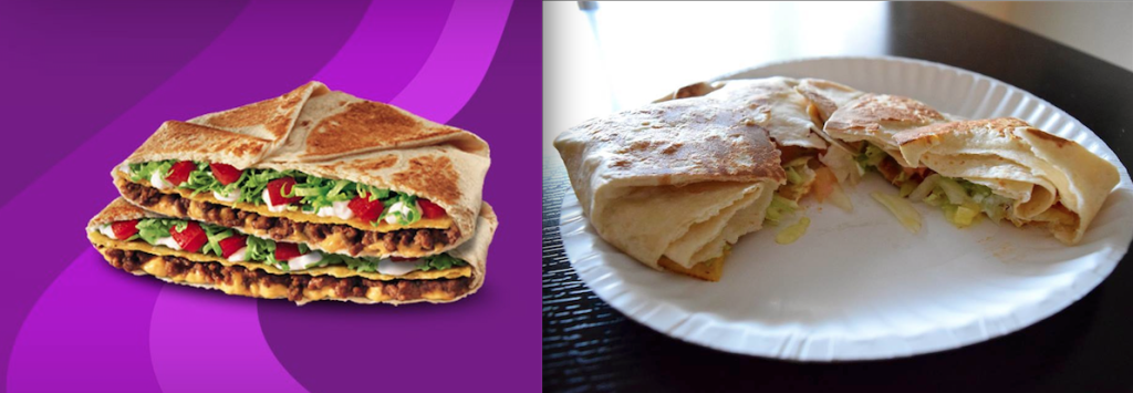
2. Taco Bell’s Crunchwrap Supreme

Photo left courtesy of Taco Bell. Photo right by Jessica Liu
Are these even the same products? The advertisement for the Crunchwrap Supreme is colorful and inviting; the tomatoes are juicy, the lettuce is fresh, and you can already hear the crunch of your first bite. Unfortunately, the real thing looks more like sadness in a tortilla. Everything looks like monochromatic mush falling out onto the plate.
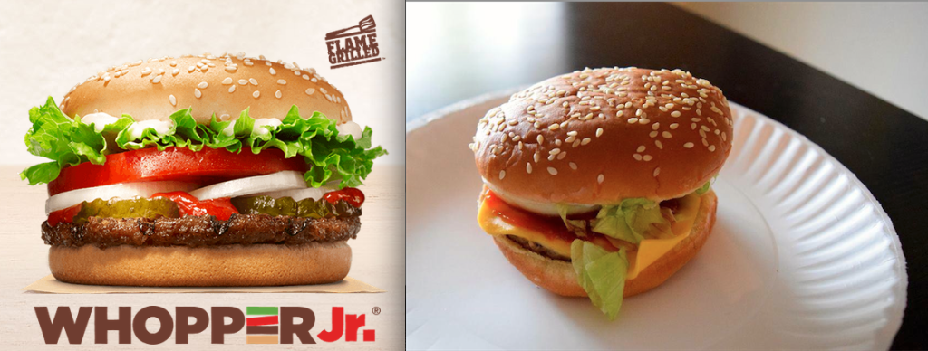
3. Burger King’s Whopper Jr.

Photo left courtesy of Burger King. Photo right by Jessica Liu
First and foremost, we have to acknowledge that Burger King’s advertisement is ridiculously unrealistic and sets unattainable goals for their food. That being said, we think the real deal does pretty well for itself. It isn’t perfect, but nearly all ingredients are visible and look relatively fresh. We wouldn’t be disappointed leaving this drive-thru.
4. Whataburger’s Patty Melt

Photo left courtesy of Whataburger. Photo right by Jessica Liu
At first glance, we can definitely tell what this is supposed to be, and it doesn’t look too different from the advertisement. Although, upon closer inspection, the real Patty Melt is pretty lackluster. The sautéed onions and gooey sauce are nowhere to be found, and the sandwich looks like it’s been squished in your backpack between textbooks since you ordered it 4 hours ago. The real deal is definitely the ugly stepsister, while the ad was the unanimous prom queen.
There you have it – nothing is ever as good as it seems. Then again, what did you really expect to come out of $3 at Taco Bell? Regardless of looks, we’ll always love the convenience of cheap, greasy fast food just the way it is.


