Doesn’t editing defeat the whole purpose of posting a photo instantly on Instagram? The truth is, the days of seeing an unedited photo on Instagram are long gone.
Instagram has become more than a social media platform as people now use it to carefully curate a personal photo gallery. Everyone’s account is different but some have themes, from nature, fashion, minimalist, architecture — you name it. Of course, the theme of this article is food.
People seem shocked when they hear that I often spend over 15 minutes choosing and editing a photo for Instagram and that the photos are rarely posted on the day which they are taken. Although the process is more time consuming, in the end, I believe the quality of the photo is worth it. These screenshots will take you through my editing process step-by-step and show you exactly how to achieve that Insta-worthy photo.
Adjust & Lux
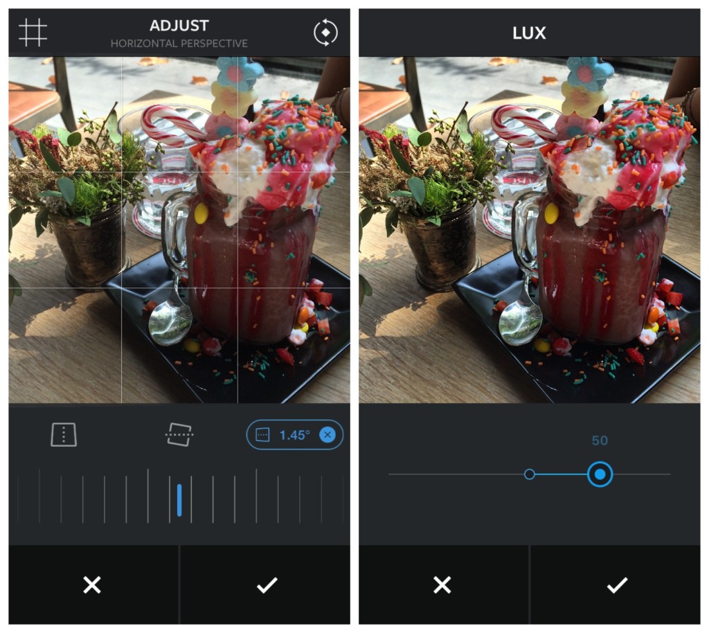
Photo by Annie Lin
These are the first two steps because they are crucial. Adjusting the perspective of your photo can fix the shape of the object if it was originally distorted or if your camera was tilted at the wrong angle. This tool can make a big difference, especially if you are editing a flat-lay.
In most cases, if you are going to use one editing tool, it should be the “Lux” function. You will be able to see a significant difference as this is essentially a one-step tool that enhances your photo overall.
Brighten & Reduce Contrast
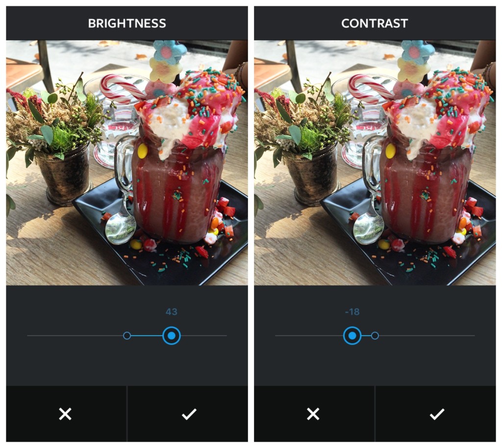
Photo by Annie Lin
If the lighting when you took the photo wasn’t particularly good, simply increase the brightness level. As you can see above, this helped increase the visibility of the image and clarify the details.
Depending on the harshness of the shadows, you will want to either reduce or increase the contrast. The level of contrast was reduced here to lighten the shadows and soften the image, which helped to mimic natural lighting.
Create Structure & Highlight
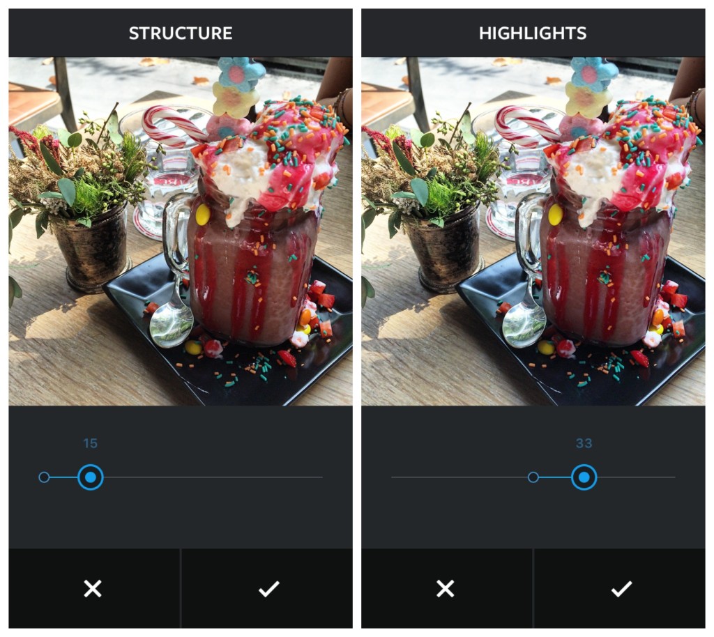
Photo by Annie Lin
You’ll want to make the food stand out by making it look more three-dimensional. Achieve this by boosting the “Structure” and giving the photo some definition. This will also intensify the shadows.
Next, to balance the shadows, increase the “Highlights.” This helps in several ways to alter the tones of color to cooler shades, strengthen the contrast, and enrich the photo with light, creating a subtle radiance that makes the food look all the more appetizing, working in the same way as if you were to sprinkle water onto pieces of fruit.
Lighten Shadows & Enhance Sharpness
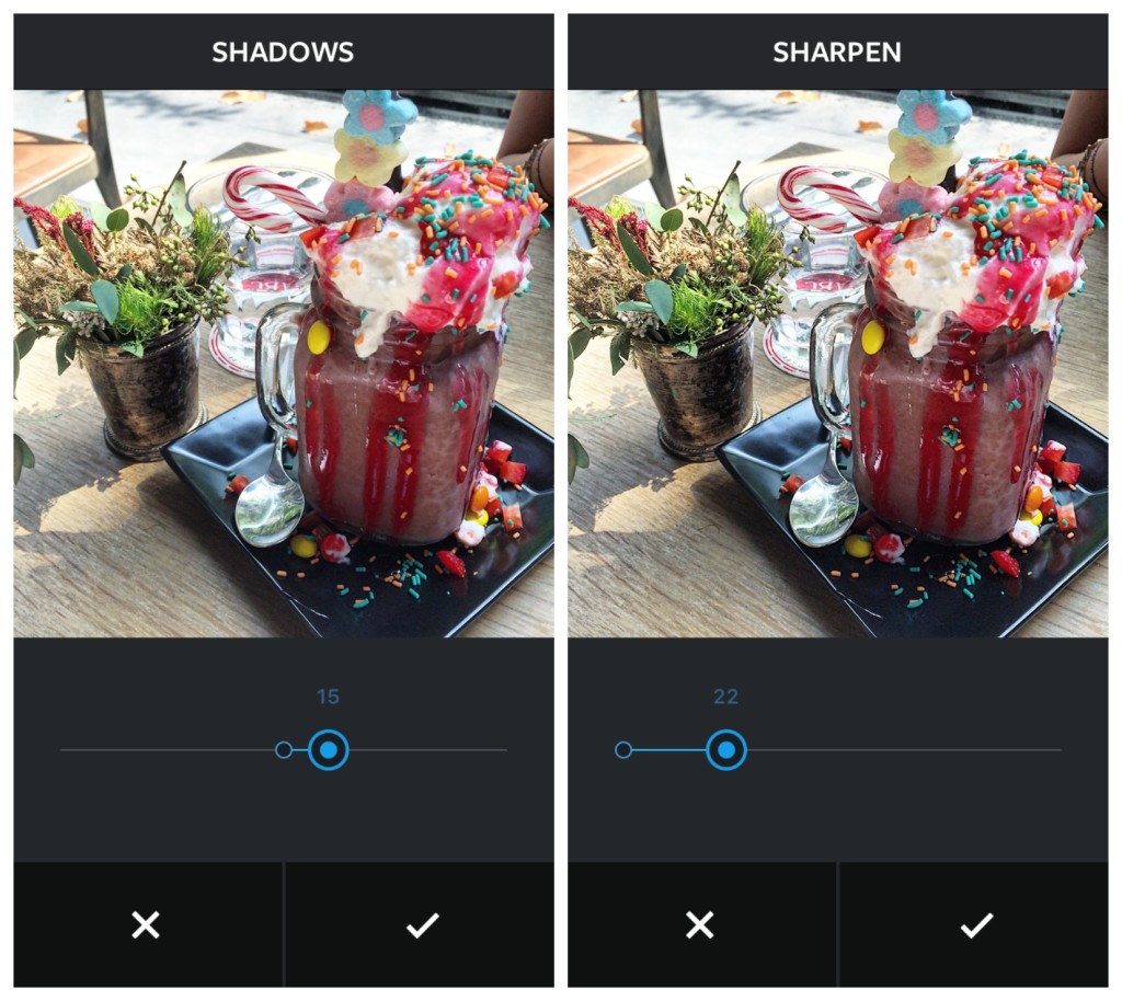
Photo by Annie Lin
Despite the improvements made to supplement light into the frame, the shadows still appear rather harsh and we want to soften them by decreasing the “Shadows.” On Instagram, increasing the number on the scale will reduce the shadows.
Never forget to “Sharpen” a photo because if you took it on your phone, chances are it isn’t going to have the best quality. This tool is a lifesaver because it noticeably enhances the quality but make sure to not over do it and keep it looking realistic.
Reduce Warmth & Boost Color
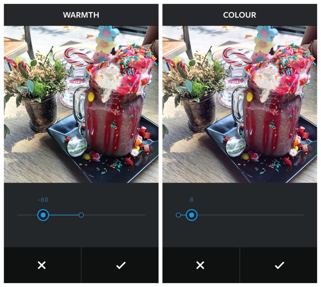
Photo by Annie Lin
I tend to always drastically reduce the “Warmth” because I find that a cooler color range helps to balance the different tones, bring out the vibrancy in colors, and generally brighten the photo. The key is to carefully balance the temperature so it’s neither too blue nor too yellow.
The “Color” function allows you to mask the highlights and shadows with colored tints ranging from yellow to green. Select accordingly depending on the dominating color in the photo composition. Less is more when it comes to this tool as a small adjustment creates a large effect.
VSCO Mellow Filter & Add Tint
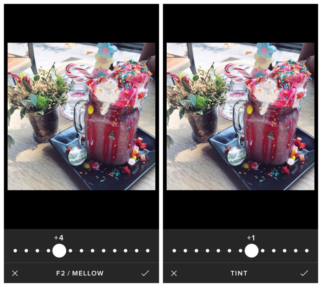
Photo by Annie Lin
The Instagram editing tools are sufficient and you could stop after that if you already think this includes too many steps, but you could also go the extra step and edit using the VSCO app. My go-to filter is “Mellow,” but because we are adding the filter after, I would suggest not going above +5 because the filter could overpower and fade out the previous editing efforts.
Unlike Instagram, VSCO’s “Tint” function only has one tint in a delicate pink color. Although not always a necessary step, in this photo I used the tint minimally to create a subtle effect, enhancing the pink color of the milkshake.
Increase Contrast & Sharpen
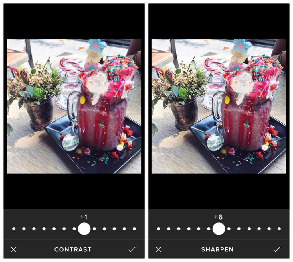
Photo by Annie Lin
In addition, some adjustments are necessary to fix what the filter has faded — shadows, contrast, structure. To modify this, increase the contrast by +1. It may seem insignificant but paying attention to the minuscule details will contribute to the overall difference.
As mentioned before, sharpening the photo will increase the clarity and develop the quality. This definition will also help construct a stronger structure for the smaller components in the photo.
Increase Saturation & Post!
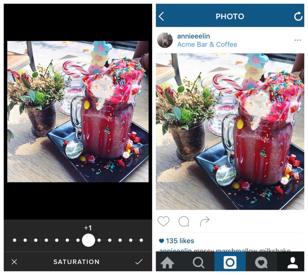
Photo by Annie Lin
As the finishing touch, the cherry on top of a sundae, or in this case, the sprinkles to top off a milkshake, you should boost the saturation. This will make it look as appealing as possible with vivid pops of color.
Now you’re done… almost!
Lastly, post it on Instagram, sit back, relax, and watch it get all the likes.
Disclaimer: Screenshots shown are not from the process of editing the photo which was posted on Instagram. The photo was posted before this article was written.


