What do the Norwegian fish smokery Rokeriet, the British retail giant Morrisons, and the Italian confectionery Ferrero Group have in common? You might not be able to answer this off-pat now, but once you have a look at the brilliant packaging designs of their products, it will be quite obvious.
Packaging is not only believed to influence buying decisions, but sometimes it is also a medium to communicate the brand’s concept and story. Just like food breathes life into our effete bodies (and souls), innovative packaging can help food brands conjure up a lively and friendly image in the minds of the consumers.
Here’s a round-up of the food brands which are capitalizing on this very benefit of packaging:
1. Nuts.com
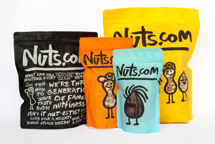
Photo Courtesy of thedieline.com
The Braverman family, who run the company—Kenny (son of “Poppy Sol), his son Jeffrey, Uncle Sandy and Cousin David—are cartoonized as nuts on the package. The brand roped in Pentagram’s Michael Bierut to create a distinctive identity by incorporating the chatty and slightly quirky voice of Nuts.com into the package. And he did just that by using hand-drawn typography and illustrations. Their shipping bags and boxes assure you that their products are the “Way to your taste buds!” exclaiming things like “Isn’t it nut-astic?”
2. Rokeriet
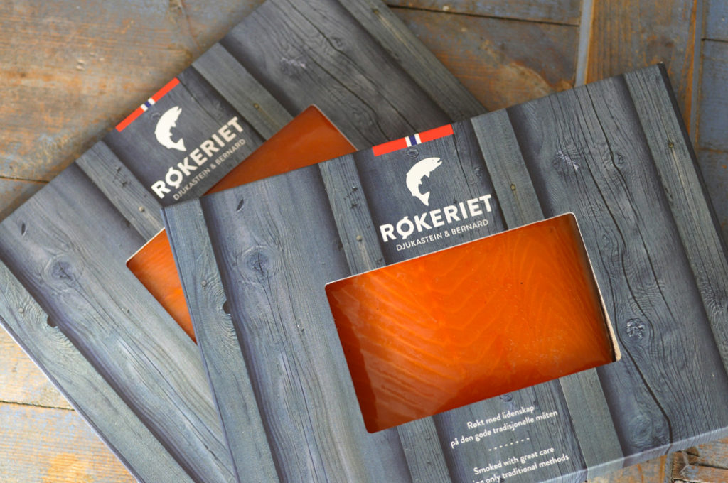
Photo courtesy of lovelypackage.com
This fish smokery in Bergen, Norway uses smart packaging that communicates the positioning—use of natural and conventional methods of smoking and preserving salmon. The design is contemporary yet traditional, effectively visualizing the high quality of the products.
3. Thelma’s Treats
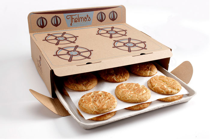
Photo courtesy of thedieline.com
Thelma’s Treats use a box-package that mimics an oven. What could be a better way to tell your consumers that your brand prides itself in the ‘freshness’ its products?
4. ChokaBlok
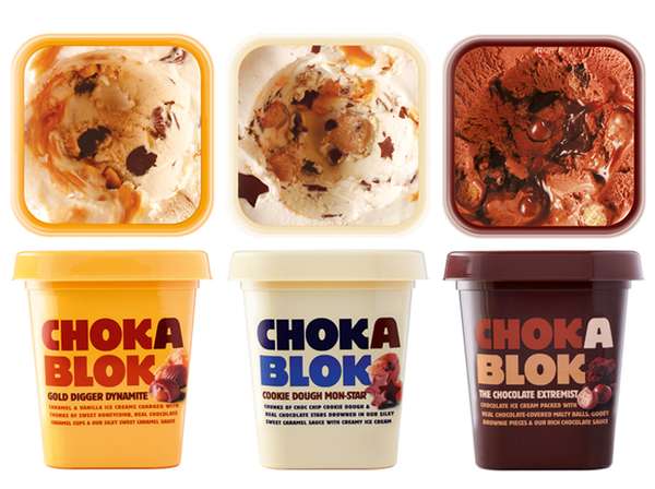
Photo courtesy of trendhunter.com
Yes, those containers are closed! The near-realistic picture on the lid of ChokaBlok ice cream gives the impression that the container is open. The design instantly attracts attention, makes you stop and take notice.
5. Paper Boat
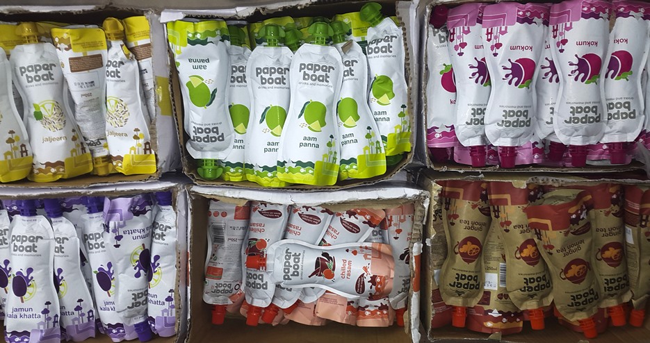
Photo by Sabhyata Badhwar
Hector Beverages owned Paper Boat drinks are packaged in standee pouches made of a material that looks and feels like paper. The minimal design reflects the simplicity and purity of the drink inside. The brand carefully uses a variety of elements: a flexi-pouch, so it feels like you’re squeezing a fruit while you’re sipping, and the friendly language that evokes nostalgia.
6. Green Berry Tea
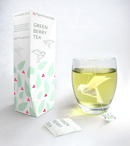
Photo courtesy of lovelypackage.com
The most agreeable feature of a Green Berry Tea package is the origami tea bags in the shape of a bird, which unfurls its wings as the tea infuses. Talk about ingenuity!
7. Kallo
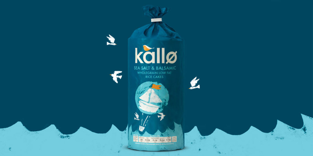
Photo courtesy of feelgoodbrands.uk.com
Organic foods company, Kallo redesigned its package to give a handmade appeal to the products by using traditional techniques such as lino printing. A more personal feel was given to the brand by choosing soothing colours and a bird perched atop the letter ‘a’.
8. Nerds
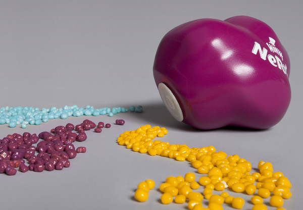
Photo courtesy of thepackaginginsider.com
Back in the day, Wonka Nerds came in a colourful, re-usable vessel that looked just liked the delicious treats inside. Through the years, Nerds have been made available in many new flavours, and are now sold in a box with two separate compartments, each containing a different flavour. The use of bright and bold colours on the package communicates the candour that the brand is all about.
9. Pasta La Vista
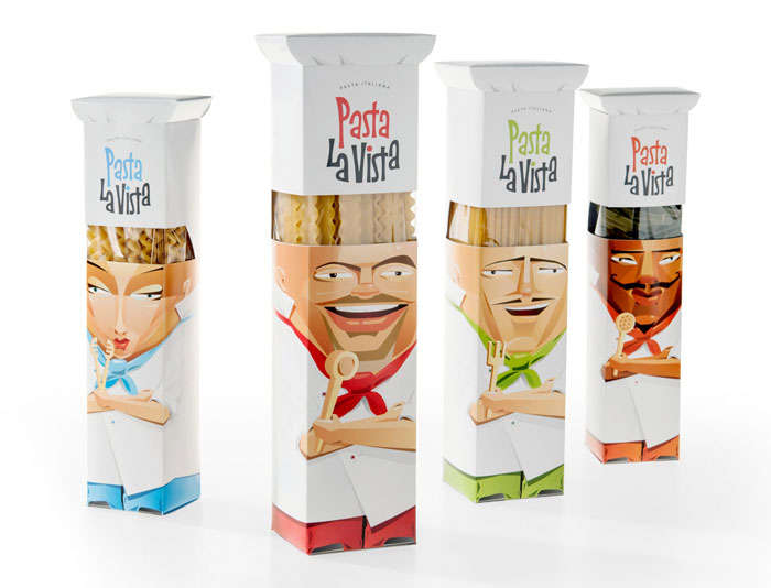
Photo courtesy of trendhunter.com
The key differentiation of this brand is the hand-made manufacturing process that goes hand in glove with traditional Italian recipes. The brand communicates this via four characters—Mario, Francesco, Giovanni, and Francessa. Every pack depicts one of these four Italian chefs.
10. Morrisons
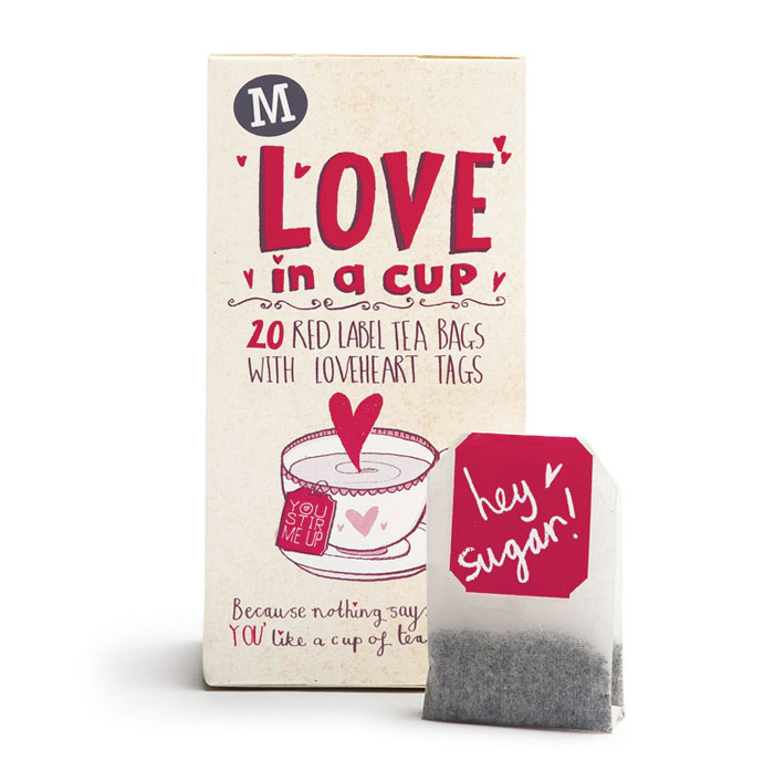
Photo courtesy of thedieline.com
According to this British retailer’s website, they are passionate about two things: Food and Packaging. They ensure that any product doesn’t arrive at their stores or your home battered and bruised, but they only ever use what’s necessary, whittling down excess packaging.
Morrisons introduced a private brand of promotional tea by the name “Love in a cup.” The design by the English firm Elmwood incorporated a handwritten typography style and hand-drawn imagery, making it a fun and unique gift. The tea bags came with five different messages that attempted to suffuse an element of occasion and romance to an everyday task of drinking tea, capturing the simple and beautiful moments between loved ones.
11. Kinder Joy
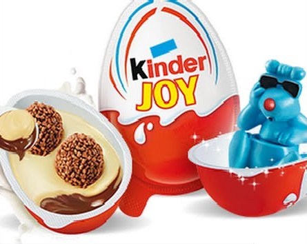
Photo courtesy of youtube.com
Ferrero Group’s Kinder Joy has a surprise factor in the form a small toy in each package. The package is egg-shaped, containing milk and cocoa cream with wheat germ and two crunchy wafer balls, along with a small spoon to devour all of it. Kinder Joy, through its packaging, emphasizes the joy the product brings to the children while assuring the mothers of the quality and safety.
12. Urban Fruit
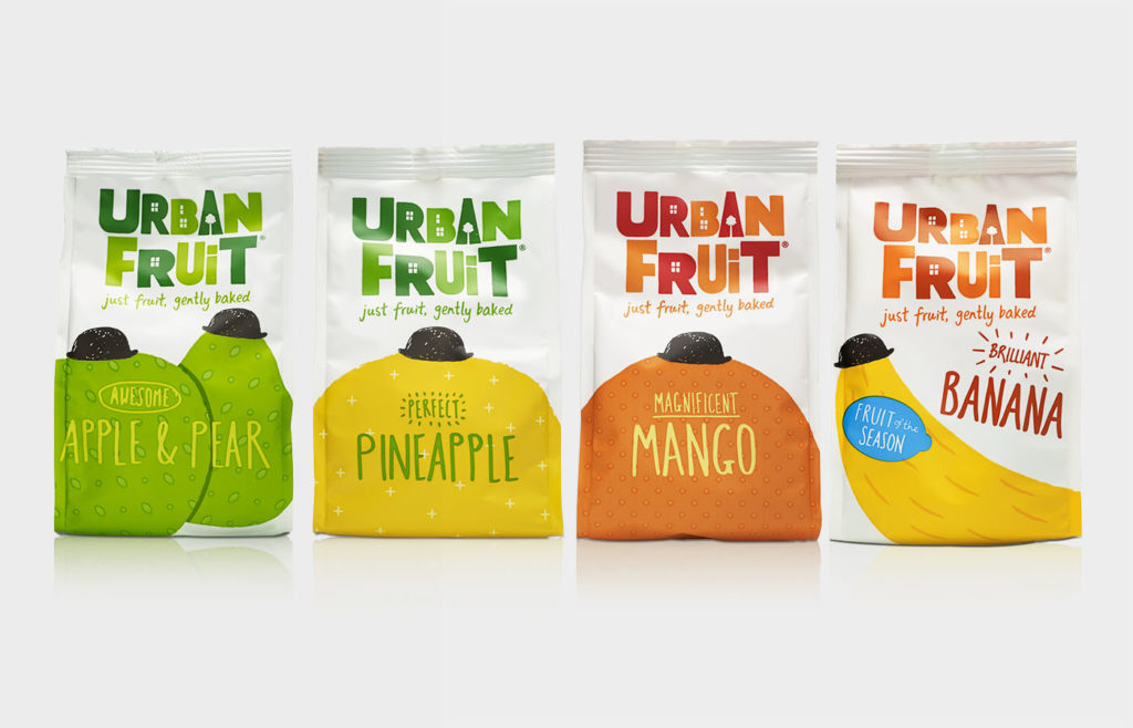
Photo courtesy of bandb-studio.co.uk
This UK-based dried fruit snacks maker uses a bright splash of colour on the packages, conveying the essence of a “delicious fruit, picked when it’s perfectly ripe, and then gently baked at low temperatures.” The presence of the signature bowler hat on each fruit is symbolic of the city’s suave and the affable typography of the countryside’s affordability.
13. Toblerone
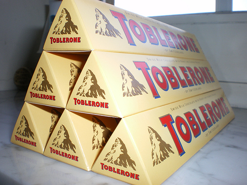
Photo courtesy of flickr.com
This list cannot be thorough without the mention of Toblerone. The iconic Swiss brand of chocolate has the most memorable packaging design which is believed to be inspired by The Matterhorn of the Swiss Alps. The unmistakable triangular shape was created by Theodor Tobler and his cousin Emil Baumann in 1908, and the famous carton packaging has been there from word go. Alternatively, it is rumored that the shape may have been inspired by a more exotic theme: Theodor Tobler made regular business trips to Paris where he saw cabaret dancers, clad in red and beige, who closed their stage act with a human pyramid, based on which he conceptualized Toblerone’s unique branding.


